01/06
Brand design · Personal brand
Ritvik Singh
A portfolio for a cybersecurity analyst — structured like an operating surface, not a résumé template.
Live surface
www.ritviksingh.in ↗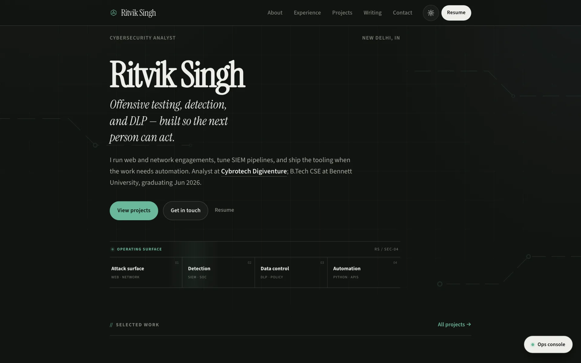
Brand system
A personal operating surface — precise, warm, and credible. Brand, type, and color work like a security console: readable under pressure, never decorative for its own sake.
01 · Colour
5 swatches
Carbon
Primary background
Parchment
#F2F0EB
Primary text
Copper
#D97B4A
Accent & CTAs
Steel
#8FA3B8
Secondary highlight
Graphite
#7A7570
Muted copy
02 · Typography
3 faces
01 · Display
Instrument Serif
Offensive clarity.
Headlines, section titles, and the analyst voice.
02 · Body
Source Sans 3
Built for reading between incidents.
Navigation, case notes, forms, and long-form reading.
03 · Signature
Allura
Ritvik Singh
Intro signature animation and personal mark moments.
03 · Specifications
6 groups
Identity
- Positioning
- Cybersecurity analyst — offensive testing, detection, DLP, and shipped products.
- Tagline
- Analyst who ships, not a résumé template.
- Personality
- Precise, warm, credible, ops-minded.
- Tone
- Direct and technical — no buzzword padding.
Logo & mark
- Monogram
- RS initials in a rounded square with copper-to-orange gradient.
- Wordmark
- Instrument Serif name + mono tail for role label.
- Signature
- Animated Allura stroke intro on first visit.
- Clear space
- Minimum padding equal to mark height on all sides.
Typography rules
- Display tracking
- −0.03em on headlines for editorial tightness.
- Body size
- 15px base, 1.65 line-height for long reads.
- Nav labels
- 12.5px Source Sans 3 with numbered mono prefixes (01, 02…).
- Meta text
- 10px mono uppercase for labels, dates, and file paths.
Colour usage
- Background stack
- #121212 base → #1A1A1A elevated → #222222 soft panels.
- Accent use
- Copper (#D97B4A) for links, focus rings, and active nav only.
- Semantic
- Green ok · amber warn · red danger — never decorative.
- Selection
- Copper tint highlight on selected text.
Layout & spacing
- Max width
- Editorial ~720px for prose, wider for work grids.
- Section rhythm
- Consistent 48–80px vertical gaps between chapters.
- Nav
- Pill container with border — floating, not full-width bar.
- Mobile
- Single column, thumb-reachable CTAs, no horizontal scroll.
Motion & UI
- Intro
- SVG signature draw-on-load — skippable, respects reduced motion.
- Buttons
- Pill resume CTA — dark fill inverts on hover.
- Cards
- Subtle border-line hover — no bounce or parallax theatre.
- Focus
- 2px copper outline, 3px offset — keyboard-first.