02/06
Brand design · E-commerce
POSHAK / SWADISH
Two connected handmade brands — devotional clothing from POSHAK and food-led storytelling from SWADISH — under one digital home.
Brand system
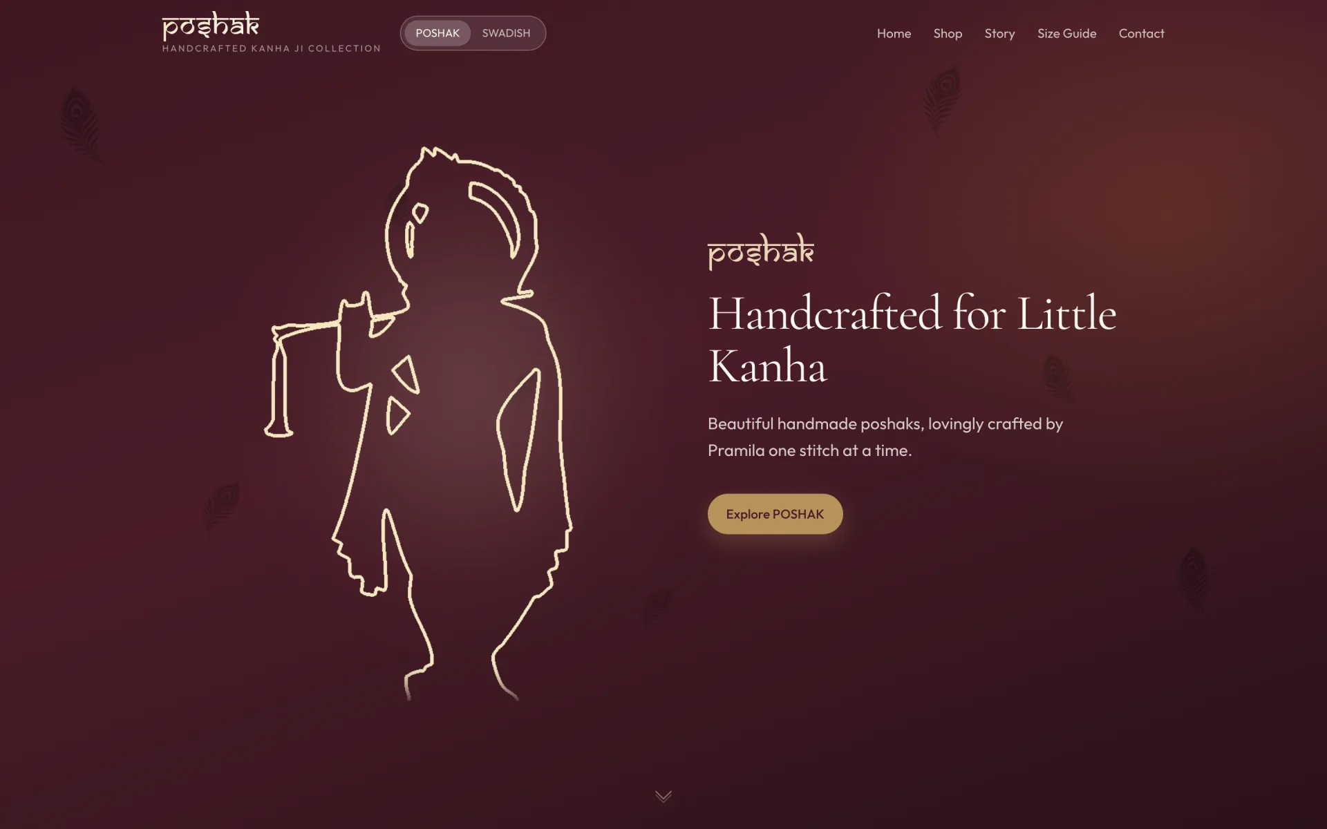
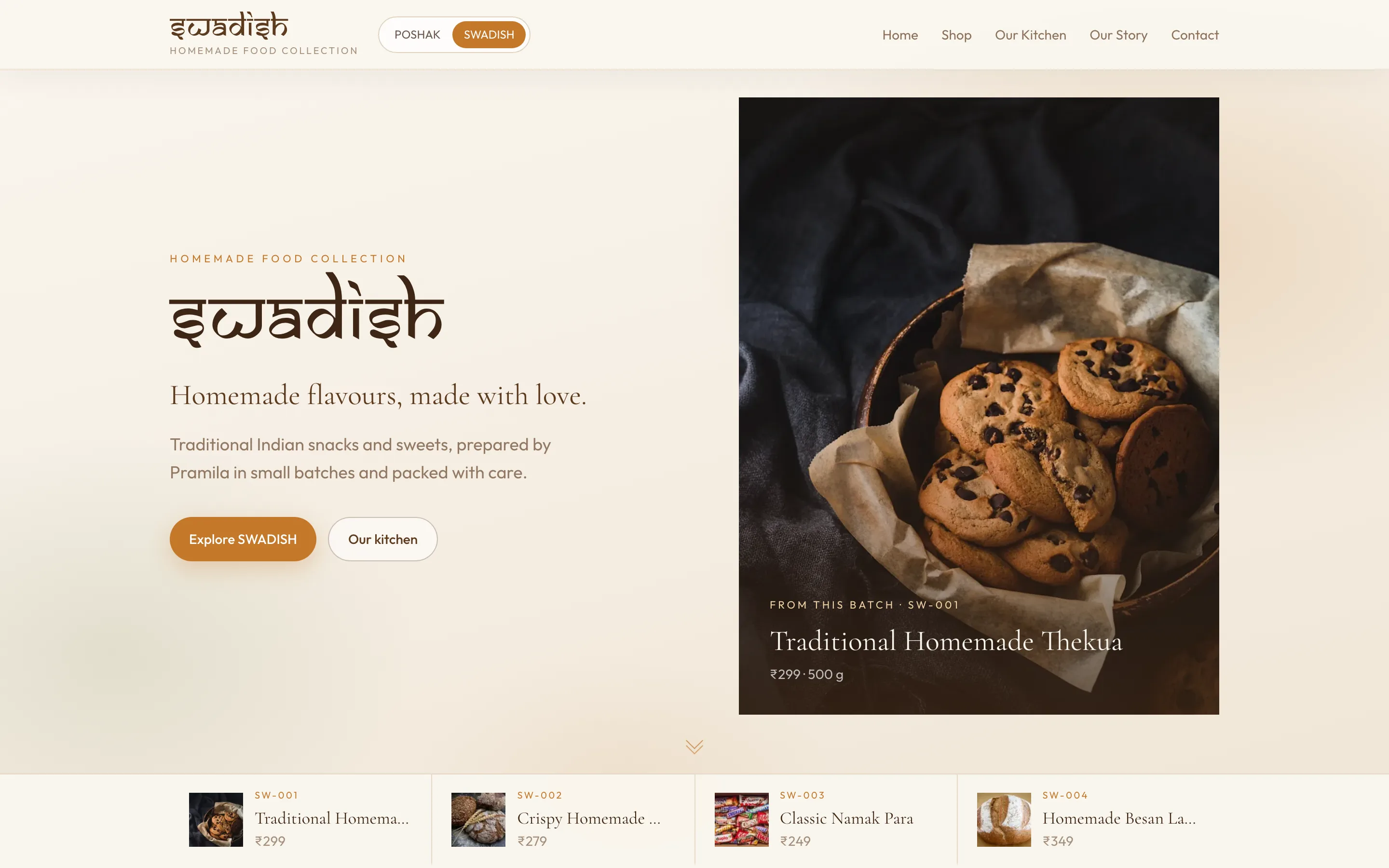
Two handmade brands under one roof. POSHAK holds devotion and craft in deep wine tones; SWADISH opens into cream, saffron, and kitchen warmth — connected by structure, never blended.
01 · Colour
7 swatches
POSHAK Wine
Devotional primary
POSHAK Rose
#C98B95
Soft accent
SWADISH Cream
#FFFCF8
Food brand base
SWADISH Saffron
#C9832D
Warm accent
SWADISH Ink
#3C2E24
Wordmark & primary text
SWADISH Surface
#FDF8F2
Food brand background
Shared Gold
#B8925A
Bridge between brands
02 · Typography
3 faces
01 · Brand wordmark
Samarkan
swadish
POSHAK and SWADISH logotypes — Latin letterforms with Devanagari-style shirorekha and matras.
02 · Display
Cormorant Garamond
Handcrafted with devotion.
Collection titles, hero lines, and devotional headlines.
03 · Body
Outfit
Clear enough for a first-time buyer.
Product details, navigation, FAQ, and order paths.
03 · Specifications
6 groups
Identity
- Architecture
- Dual brand — POSHAK (devotional wear) + SWADISH (homemade food).
- POSHAK promise
- Hand-knitted Kanha Ji clothing with devotion and craft.
- SWADISH promise
- Homemade flavour from a family kitchen — tangible and warm.
- Tone
- Handmade, plain, devotional — never corporate or marketplace-generic.
Logo & wordmark
- Primary logotype
- Samarkan — Latin letters with Devanagari-style shirorekha (top bar).
- POSHAK mark
- Samarkan wordmark in gold-pale on wine gradient hero.
- SWADISH mark
- Samarkan wordmark in deep brown (#3C2E24) on cream (#FDF8F2).
- Animation
- logo-shimmer — light sweep across wordmark on load/hover.
- Brand switcher
- Shared header control toggles POSHAK ↔ SWADISH without leaving the site.
Typography rules
- Wordmark
- Samarkan via .font-brand — never substituted with Cormorant.
- Display
- Cormorant Garamond 400–700 for collection titles and hero lines.
- Body
- Outfit 400–600 for nav, product copy, FAQ, and forms.
- Scale
- Wordmark ~2rem mobile → 4rem desktop; body 14–16px.
Colour system
- POSHAK gradient
- #3F1822 → #4A1C28 → #2A1218 diagonal hero wash.
- POSHAK rose
- #C98B95 — soft accents and secondary type.
- SWADISH cream
- #FFFCF8 / #FDF8F2 — primary food-brand surface.
- SWADISH saffron
- #C9832D — warm accent, CTAs, highlights.
- Shared gold
- #B8925A — bridge tone in switcher and shared UI.
- SWADISH ink
- #3C2E24 — wordmark and primary text on cream.
Illustration & imagery
- Mor pankh
- Peacock feather PNG assets — floating hero decoration on POSHAK.
- Kanha hero
- Central devotional illustration on POSHAK homepage.
- Line art
- Devotional line illustrations — not generic clip art.
- Photography
- Product and kitchen shots — handmade texture visible.
- Feather motion
- hero-feather-float — slow drift with rotation, low opacity.
Layout & components
- Catalog grid
- Product cards with image, title, price, and collection tag.
- Size guide
- Inline sizing help on product pages — reduces returns.
- FAQ
- Accordion for ordering, care, and delivery questions.
- Order path
- Enquiry-led — no anonymous checkout widget.
- Corners
- Soft rounded cards — boutique, not sharp SaaS.