← Archive
04/06
Brand design · Healthcare
Aurelia Dental
A specialist dental studio site — calm, precise, conversion-ready, without looking like clinic software.
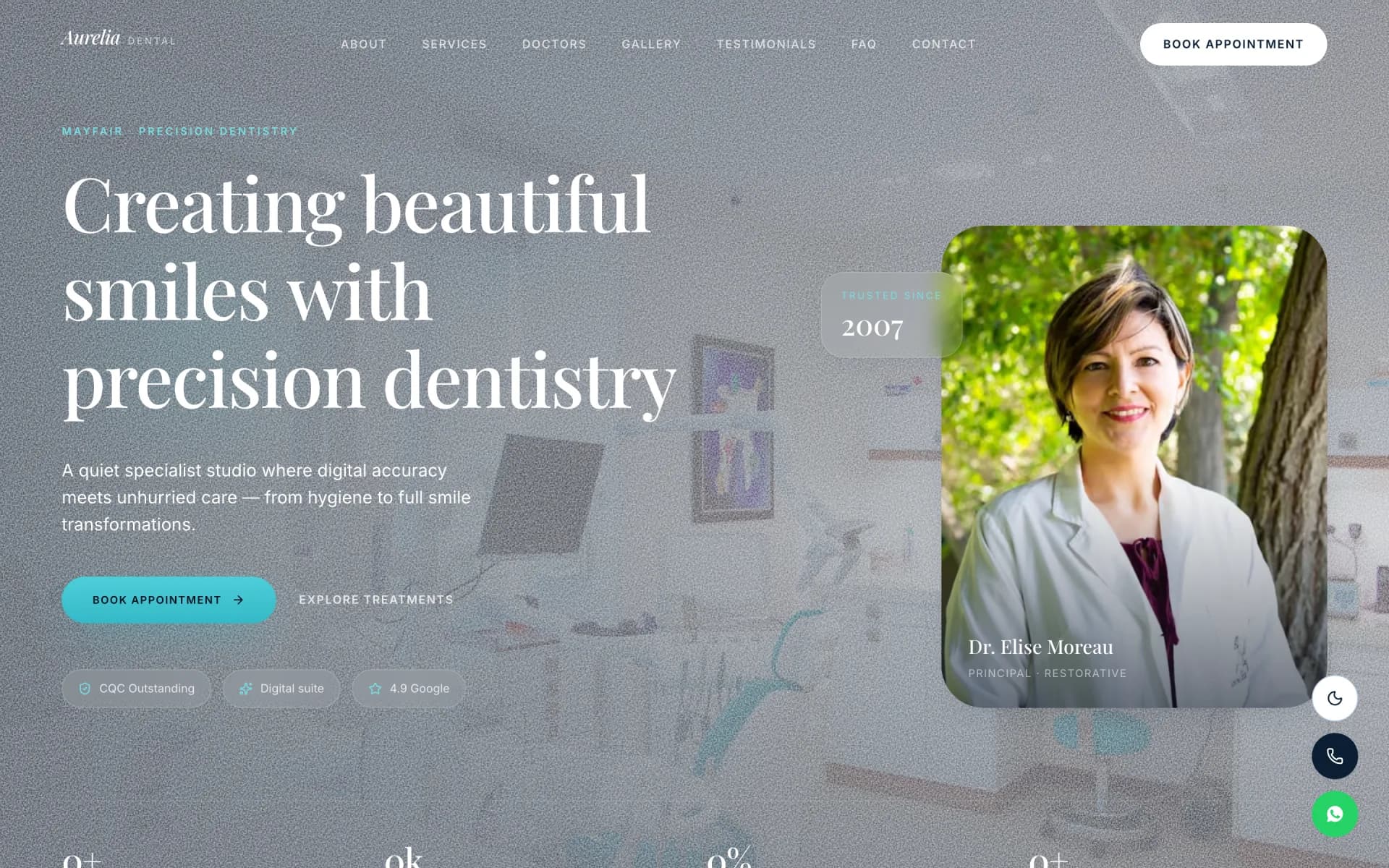
Brand system
Precision dentistry, quietly extraordinary. Cream stone surfaces, editorial serif headlines, and photography that feels like a private studio — not clinic software.
05 colours02 typefaces05 spec groups
01 · Colour
5 swatches
Primary#FAFAFA
Stone Cream
Primary surface
Midnight Ink
#061120
Primary text
Clinical White
#FFFFFF
Cards & panels
Sage Accent
#25D366
WhatsApp & action
Warm Grey
#6B7280
Supporting copy
02 · Typography
2 faces
01 · Display
Playfair Display
Quietly extraordinary.
Practice headlines, treatment titles, and editorial moments.
02 · Body
Inter
Calm, precise, conversion-ready.
Treatments, clinician bios, FAQ, and booking forms.
03 · Specifications
5 groups
01
Identity
- Positioning
- Mayfair precision dentistry — private specialist practice.
- Tagline
- Precision dentistry, quietly extraordinary.
- Tone
- Calm, editorial, trustworthy — never clinical-cold.
02
Logo & mark
- Wordmark
- Aurelia Dental — Playfair Display, refined spacing.
- Usage
- Header wordmark + footer; no aggressive dental icons.
03
Typography rules
- Display
- Playfair Display — practice headlines, treatment names.
- Body
- Inter — bios, FAQ, form labels, supporting copy.
- Scale
- Large editorial hero type; 15–16px body for readability.
04
Colour system
- Stone cream
- #FAFAFA — primary page surface.
- Midnight ink
- #061120 — headlines and primary text.
- Clinical white
- #FFFFFF — cards, panels, form fields.
- WhatsApp green
- #25D366 — messaging CTA only.
- Warm grey
- #6B7280 — supporting copy and meta.
05
Imagery & layout
- Photography
- Clinician portrait, treatment rooms — quiet, premium.
- Hero
- Portrait + precision headline + Book Appointment CTA.
- Journey sections
- Treatments → clinicians → patient journey → gallery.
- Booking
- Appointment form — validated fields, sticky mobile CTA.