← Archive
05/06
Brand design · Hospitality
Solenne
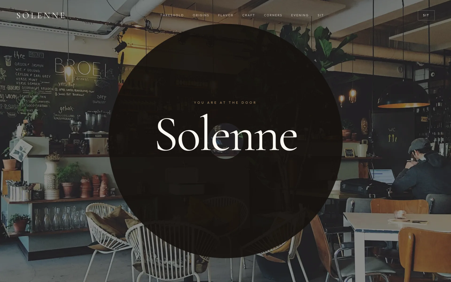
A café site that behaves like a morning — origin, craft, rooms and a seat, not a PDF menu in a template.
Brand system
A café that reads like a morning. Oak, steam, and gold hour — type that can hold poetry without breaking the menu.
05 colours02 typefaces05 spec groups
01 · Colour
5 swatches
Primary#0F0C0A
Espresso
Evening sections
Oak
#1A1511
Primary dark
Steam
#F6F1E9
Morning base
Gold Hour
#B8956A
Warm accent
Clay
#9A5640
Secondary warmth
02 · Typography
2 faces
01 · Display
Cormorant Garamond
Come sit awhile.
Poetic headlines, room names, and threshold moments.
02 · Body
Outfit
Warm, unhurried, legible.
Menu, reservations, origins copy, and navigation.
03 · Specifications
5 groups
01
Identity
- Positioning
- Neighbourhood café — atmosphere with utility.
- Tagline
- Come sit awhile.
- Tone
- Warm, unhurried, poetic — never rushed or chain-like.
02
Logo & mark
- Wordmark
- Solenne — Cormorant Garamond, light weight.
- Header CTA
- Sit in — persistent reservation cue in nav.
03
Typography rules
- Display
- Cormorant Garamond — room names, poetic section titles.
- Body
- Outfit — menu items, times, form labels.
- Menu type
- Serif dish names, sans prices and notes.
04
Colour system
- Espresso
- #0F0C0A — evening section backgrounds.
- Oak
- #1A1511 — primary dark surfaces.
- Steam
- #F6F1E9 — morning base and menu panels.
- Gold hour
- #B8956A — accents, dividers, hover states.
- Clay
- #9A5640 — secondary warmth in photography grades.
05
Imagery & motion
- Hero
- Full-bleed interior threshold — guest POV walking in.
- Sequence
- Threshold → first light → origins → taste → craft → sit.
- Modules
- Interactive origin and flavour sections before menu.
- Motion
- Slow fades; respects prefers-reduced-motion.